Tag: writing

  • How do you plan the layout of your sketchbook pages?

    And how that varies between formats.

    The answer is well that depends……

    On location my pages develop almost organically, I choose a starting point and “grow’ my spread from there. my pages are usually filled with “vignettes” – small sketches with no defined edges.

    I have to admit that the hardest thing is knowing when to stop!

    In the studio I can be more organised and do some rough layout plans, though often I just wade in there the same as if I were on location.

    I’ll show you some different pages here, in several different formats of sketchbook and as you will see there are endless possibilities.

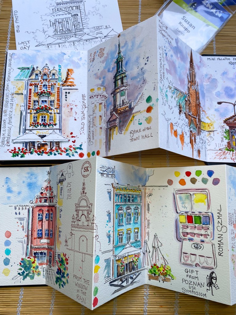
    Zig zag, or Leporello sketchbooks, my choice for traveling.
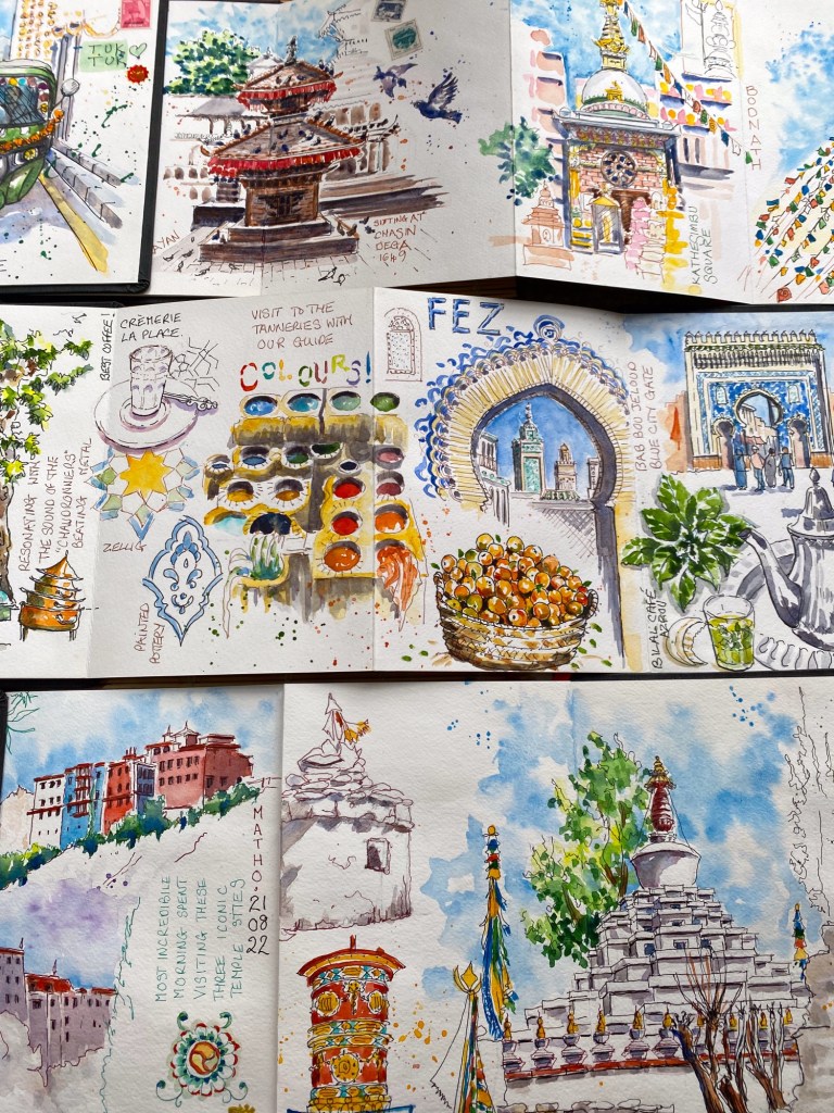
    These are such a joy to use, light to carry around, and make for great panoramic sketches, or multiple vignettes.

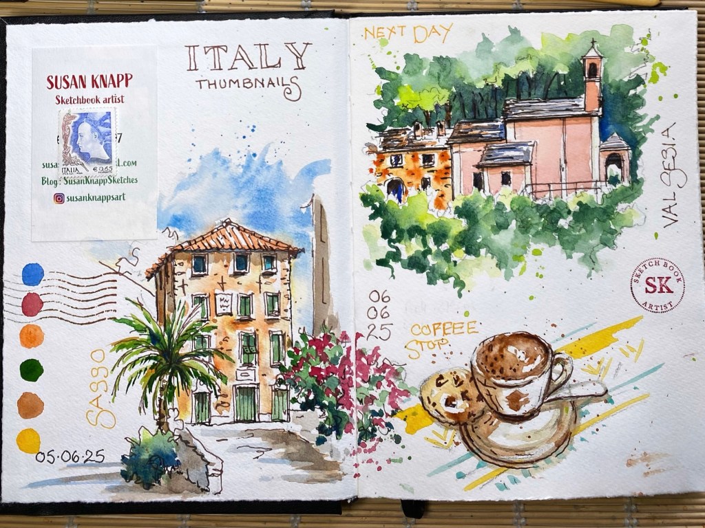
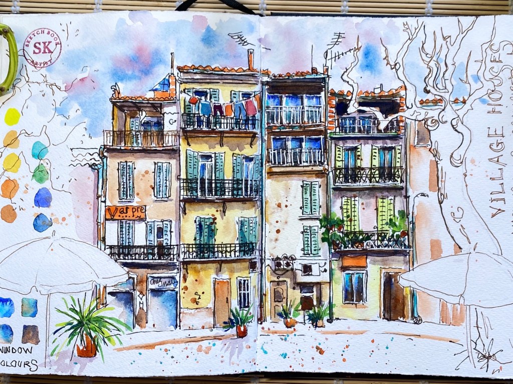
    A5 Portrait

    My day to day choice, easy to handle, easy to layout the pages, and easy to photograph.

    “Italy” on the left is a series of multiple sketch “vignettes” added as the day went on. The village houses on the right hand page are just one sketch. The A5 works for both.
    A5 Landscape

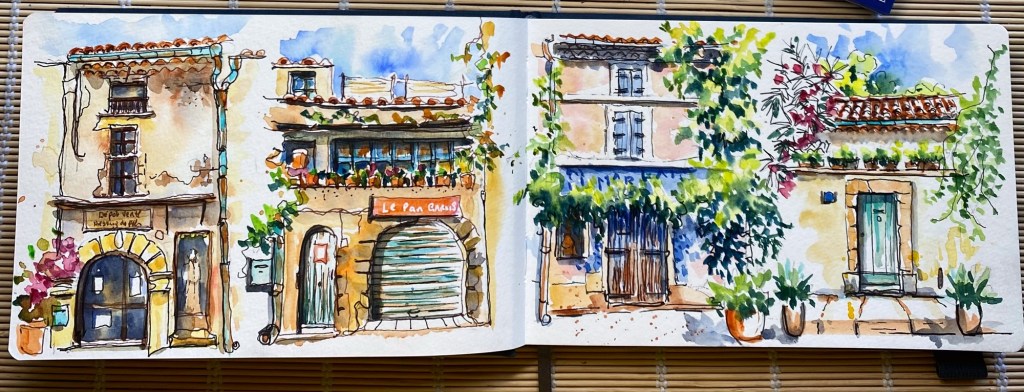
    This format is more of a challenge for me, harder to use and a bit tricky to photograph. But works really well for several sketches, or a panorama. These are very uniform and aligned, unusual for me.
    Square 20 x 20

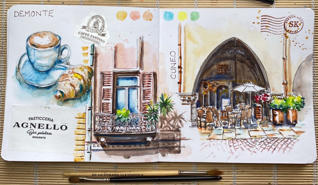
    Another favourite, I love composing my pages with these books, lots of possibilities for a double page, or two separate sketches.

    Or, as here, connecting vignettes with a theme.
    A4 loose sheets

    Simple to transport, easy to use portrait or landscape. Again I use these for multiple or single sketches.
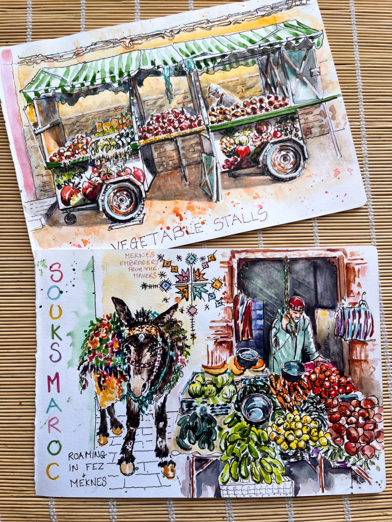
    If you want to learn more about layouts I’ll be covering this is my Morocco workshop next March
    Morocco art retreat

  • Hooked on green

    Painting green can be fascinating or frustrating, or sometimes both at once.

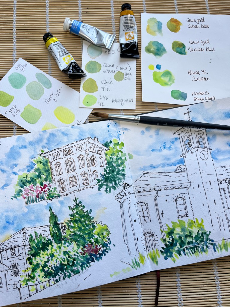
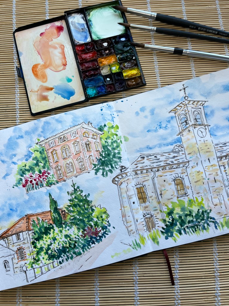
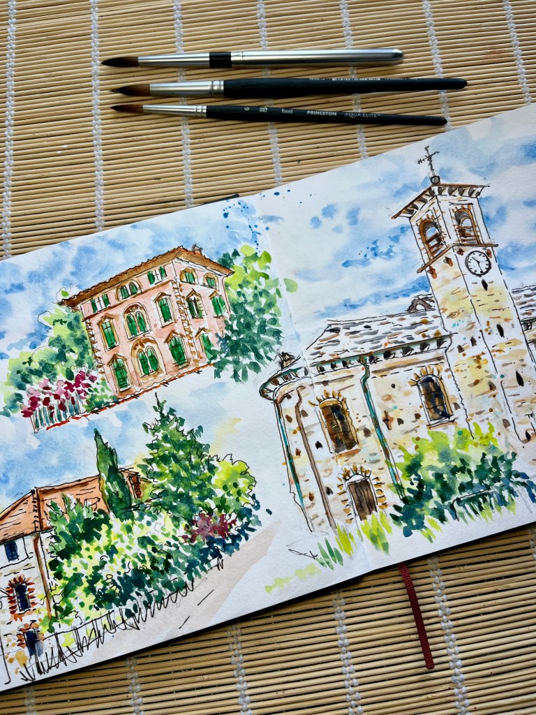
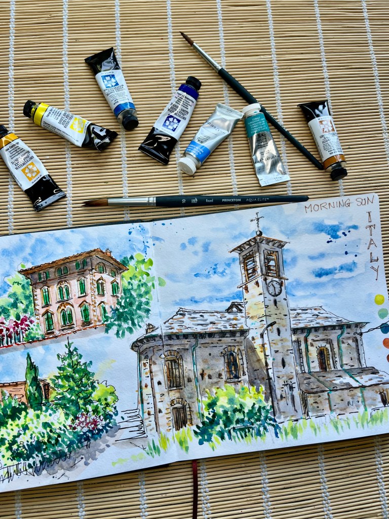
    This post is a step by step guide to how I painted this double page, starting with greens and the blues of the sky.

    I sketched the pages on location in Italy on a hot sunny day but time constraints meant that I had to add the colour at home.

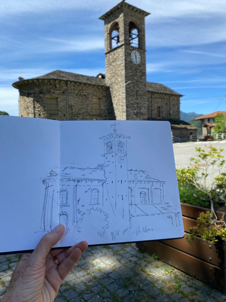
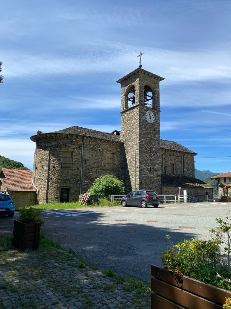
    This is the sketching spot, and my first sketch, I only had to turn to then sketch the other two vignettes.

    I nearly always start with the sky, that’s about the only academic rule that I follow.

    Then when I came to the greens I wanted to try and convey the contrast and the profusion so I decided to use a big brush, a Princeton Aqua Elite size 10. Above left.

    In doing so I had no choice but to paint in a loose and free style, letting the paint work its magic. My greens are mostly mixed from blues and yellows.

    The photo above right shows my first washes on the buildings, dropping colours onto wet paper. As you can see it’s very washed out and doesn’t look finished.

    Above left everything is starting to look better, with a second wash and more detail.

    Above right the finished pages, everything comes together when I add the shadows. Feel the heat of the sun!

    Two important things to note about shadows, they are not grey and they vary in darkness.

    I mix my shadows with browns and blues, yellows and purples, sometimes adding orange and red, there are so many possibilities. I never use black or grey.

    The part of the object that is in the shade is lighter than a shadow that is cast onto the object. just look at the triangle cast shadow on the side of the church tower, it it darker than the walls in shadow.

    If you want to know about future workshops and events, or even receive the occasional “Hints and Tips” email click on the link below to subscribe.

    https://susans-newsletter-db5457.beehiiv.com