Tag: art

  • Ready to roll, are you travel ready?

    Summer is upon us, whether you are going away or staying home keep your sketching kit ready!

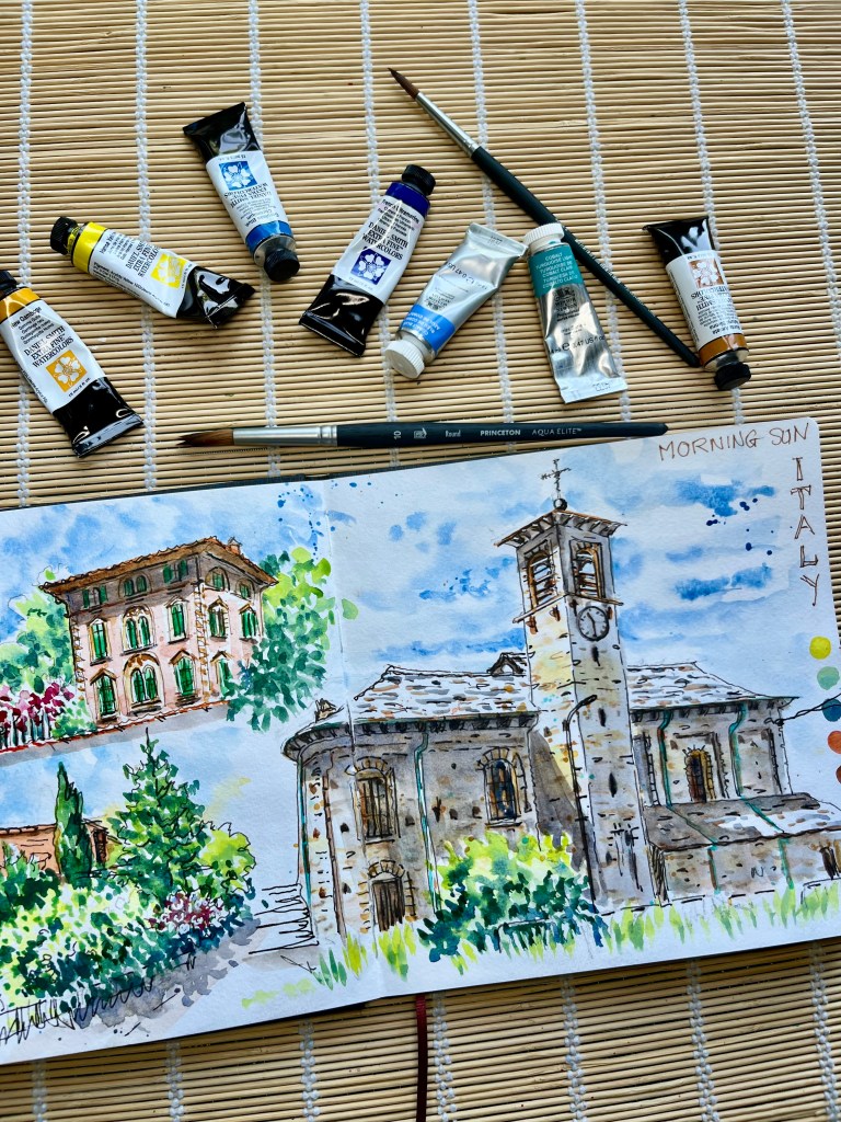
    Here is a breakdown of my materials which I use near home and exactly the same when I travel.

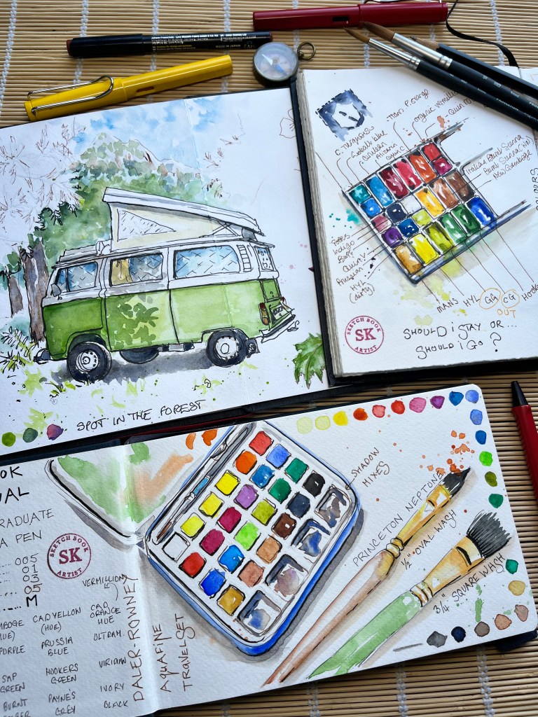
    In the image above is a sketch of our trusty VW camping car which has taken us on numerous family holidays in Europe.

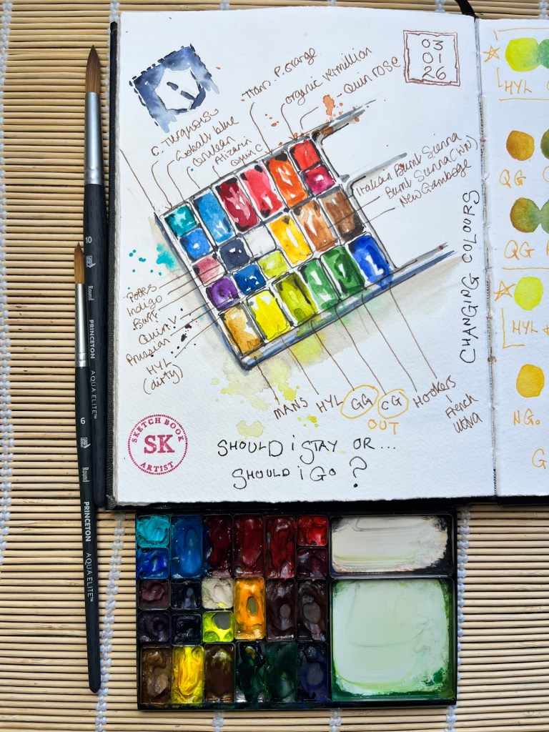
    Also sketches of my palette, which I often add to my pages to remind me of any changes I may have made.

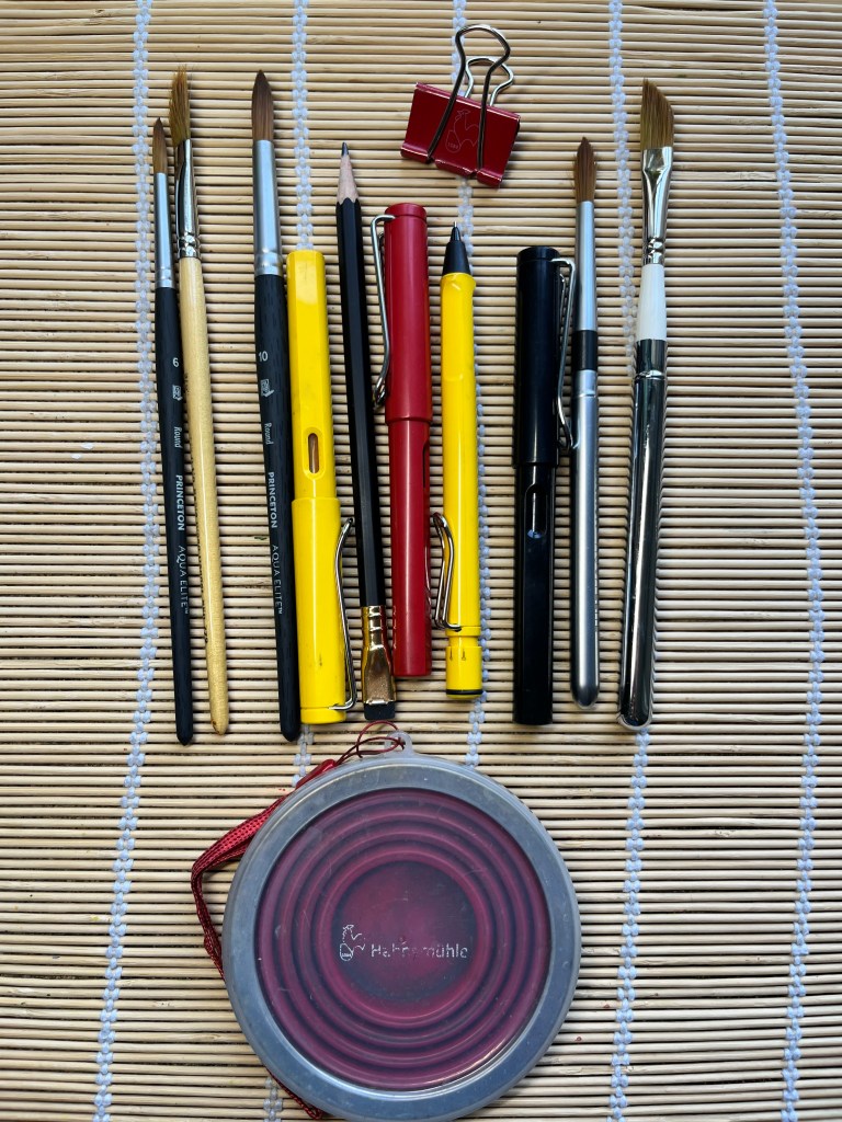
    Below are images of my materials and underneath that a short description of the colours and brands.

    I keep all my materials in an Art Toolkit case, I have 2, this is the larger one.

    My palette is also Art Toolkit in which are 23 godets that I fill with tube colours. They might seem small but honestly they last a long time, I’ve never run out even on three week trips.

    Colours:

    Cobalt turquoise, Potters pink, Cobalt blue, Burnt Sienna, Quinacridone violet and Hookers green from Winsor and Newton.

    Cerulean blue chromium, Prussian blue, French ultramarine, , Indigo, Permanent Alizarin crimson, Quinacridone coral, Transparent pyrrole orange, Organic vermilion,Quinacridone rose, Buff titanium, Italian burnt Sienna, Monte amiata natural Sienna, New Gamboge, Hansa yellow light ( in two godets, as I often get one that turns green when I’m mixing),and Phtalo green from Daniel Smith.

    Quinacridone gold from Holbein.

    Pens are Lamy Safari, Inks de Atramentis, brushes Princeton and Rosemary & Co.

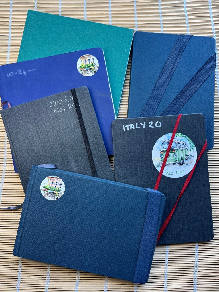
    Sketchbooks….. ahh the big question!

    I have several favourite brands and types, in general I like cold pressed, white but not too bright, !00% cotton ( or at leas 50% cotton). I like Portrait format, generally in A5, for tavelling I always take several Zigzag books.

    The brands are Hahnemuhle, Stillman & Birn, Canson and recently discovered Sennelier.

    I hope that this post is helpful, occasionally I add things but this is the base for everything I do, even in the studio.

  • Hooked on green

    Painting green can be fascinating or frustrating, or sometimes both at once.

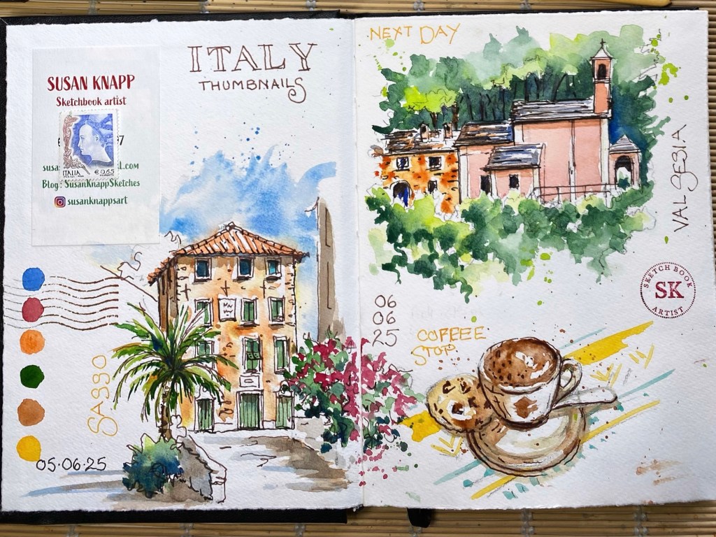
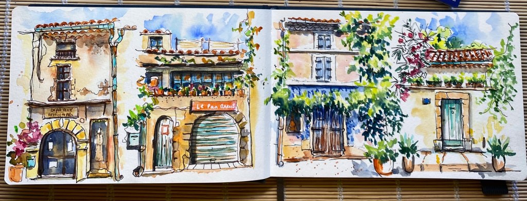
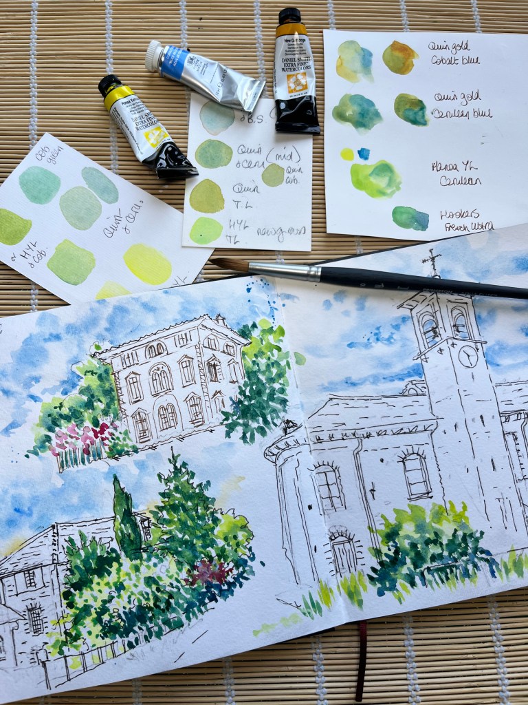
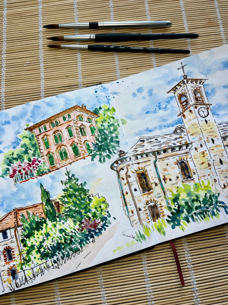
    This post is a step by step guide to how I painted this double page, starting with greens and the blues of the sky.

    I sketched the pages on location in Italy on a hot sunny day but time constraints meant that I had to add the colour at home.

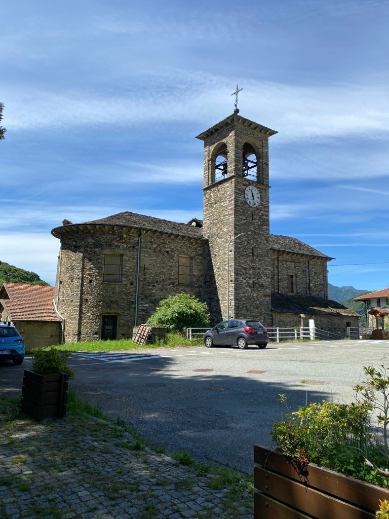
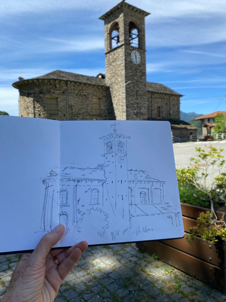
    This is the sketching spot, and my first sketch, I only had to turn to then sketch the other two vignettes.

    I nearly always start with the sky, that’s about the only academic rule that I follow.

    Then when I came to the greens I wanted to try and convey the contrast and the profusion so I decided to use a big brush, a Princeton Aqua Elite size 10. Above left.

    In doing so I had no choice but to paint in a loose and free style, letting the paint work its magic. My greens are mostly mixed from blues and yellows.

    The photo above right shows my first washes on the buildings, dropping colours onto wet paper. As you can see it’s very washed out and doesn’t look finished.

    Above left everything is starting to look better, with a second wash and more detail.

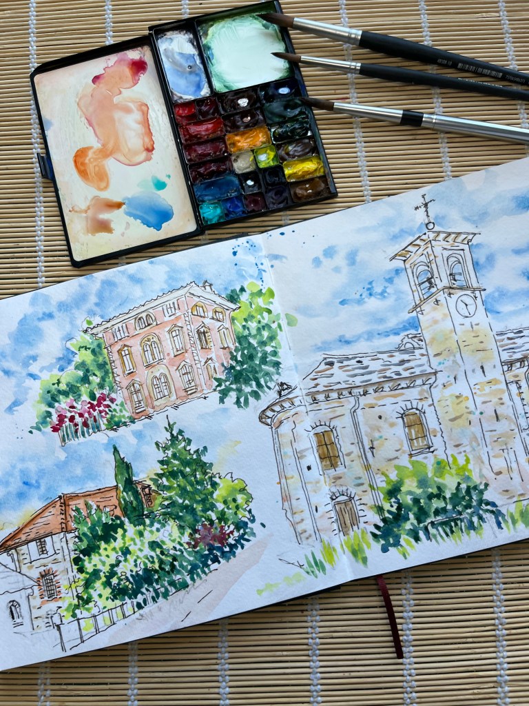
    Above right the finished pages, everything comes together when I add the shadows. Feel the heat of the sun!

    Two important things to note about shadows, they are not grey and they vary in darkness.

    I mix my shadows with browns and blues, yellows and purples, sometimes adding orange and red, there are so many possibilities. I never use black or grey.

    The part of the object that is in the shade is lighter than a shadow that is cast onto the object. just look at the triangle cast shadow on the side of the church tower, it it darker than the walls in shadow.

    If you want to know about future workshops and events, or even receive the occasional “Hints and Tips” email click on the link below to subscribe.

    https://susans-newsletter-db5457.beehiiv.com